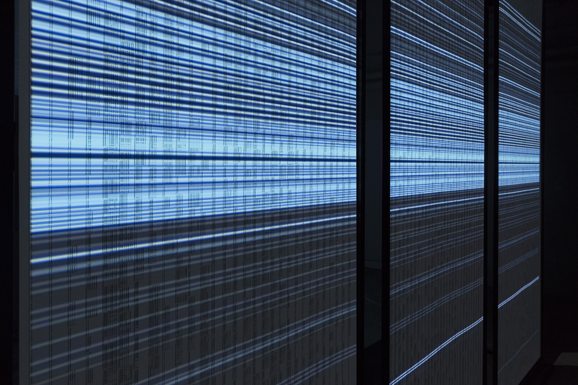
30° – Visualising Ocean Data
30° allows the viewer to explore the analysis of large quantities of data on an aesthetic as well as a spatial level. The exhibited data originates from measurements taken along the 30th meridian west, which, for the most part, runs across open ocean waters. Short animations visualise parameters such as temperature, salinity or oxygen. Graphics are used to visualise data fluctuations and comparisons of individual points of measurement. A scale allows the chronological classification of each measurement.
The multi award-winning group work hopes to draw attention to the efforts of scientists who have dedicated their work to gaining a better understanding of the sea in order to preserve the world’s oceans.
Technical Details: As this was a group project I mainly worked on the data visualisation as well as the overall design concept.
The projection was generated with VVVV and After Effects.
Video documentation by Digga Filmproduktionen.


